What is the most popular data visualization Python?
What is the most popular data visualization Python?
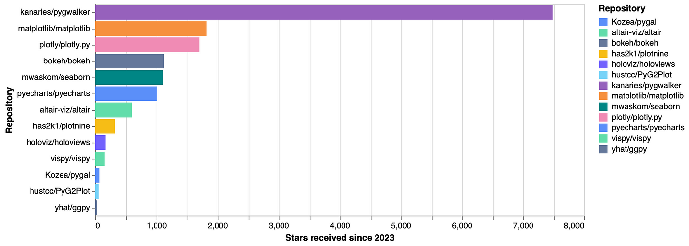
The most popular data visualization libraries in Python are Matplotlib and Seaborn, followed closely by Plotly and Bokeh.
Matplotlib: Matplotlib is one of the oldest and most widely used data visualization libraries in Python. It provides a comprehensive set of tools for creating high-quality 2D and 3D plots, charts, and graphs. Matplotlib has an extensive range of features, including support for various plot types (e.g., line plots, scatter plots, histograms), customization options (e.g., colors, fonts, labels), and integration with other popular data science libraries like Pandas and NumPy.
Seaborn: Seaborn is a visualization library built on top of Matplotlib. It provides a high-level interface for creating informative and attractive statistical graphics. Seaborn includes support for visualizing regression plots, box plots, violin plots, and more. It's particularly well-suited for data analysis and exploration tasks.
Plotly: Plotly is another popular Python library for data visualization. It's ideal for interactive, web-based visualizations and allows users to create a wide range of charts (e.g., line plots, scatter plots, bar charts), 3D plots, and even dashboards. One of the unique features of Plotly is its ability to generate JavaScript-based visualizations that can be embedded in web pages or shared via link.
Bokeh: Bokeh is an open-source interactive visualization library that targets modern web browsers for presentation. Its goal is to provide elegant, concise construction of versatile graphs, and support for high-performance interactivity over large or streaming datasets. Bokeh uses JSON as the data format and runs on various platforms such as Python, Julia, and R.
Comparison: All four libraries share some common strengths:
Support for a wide range of visualization types Easy integration with popular data science libraries (e.g., Pandas, NumPy) Customization options to tailor visualizations to specific needsHowever, each library has its unique features and use cases:
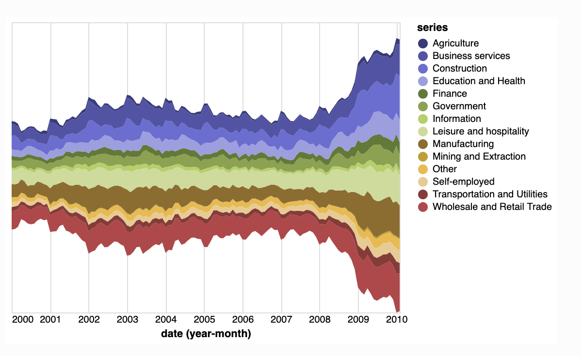
Choosing the Right Library: Ultimately, the choice of data visualization library depends on your specific needs and goals. Consider factors such as:
The type of visualization you want to create The level of customization required Interactivity or static plotting requirements Integration with other libraries or toolsBy understanding the strengths and use cases for each library, you can select the best one for your project and start creating stunning data visualizations in Python.
Data visualization in Python pandas
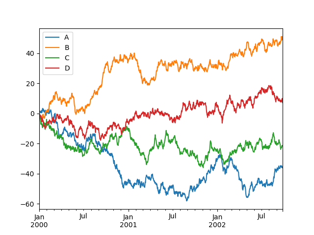
Data Visualization with Python Pandas: A Comprehensive Guide
As the saying goes, "a picture is worth a thousand words." In data analysis and visualization, this phrase takes on new meaning. By transforming complex data into engaging visual representations, we can more effectively communicate insights, trends, and patterns to stakeholders.
In this article, we'll explore the world of data visualization using Python Pandas, one of the most popular and powerful libraries for data manipulation and analysis. With pandas, you can easily import, manipulate, and analyze large datasets, making it an essential tool for any data scientist or analyst.
Why Data Visualization Matters
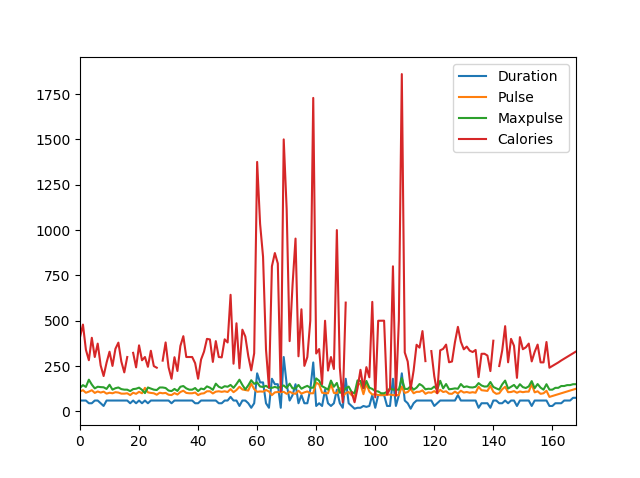
Data visualization plays a crucial role in various industries, including:
Business: To make informed decisions, business leaders need to quickly grasp trends, patterns, and insights hidden within massive datasets. Research: Scientists rely on data visualization to present complex findings, highlight relationships between variables, and identify novel discoveries. Marketing: Data-driven marketers use visualizations to track customer behavior, analyze market trends, and optimize campaigns. Education: Visual aids help students better comprehend statistical concepts, recognize patterns, and develop critical thinking skills.Python Pandas: A Powerful Library for Data Manipulation
Pandas is an open-source library developed by Wes McKinney in 2008. Its name originates from the term "panel data," which refers to multidimensional datasets with multiple observations (rows) and variables (columns). Here are some key features that make pandas a powerful tool:
Data Structures: Pandas offers two primary data structures: Series (1-dimensional labeled array) and DataFrame (2-dimensional labeled data structure). Data Manipulation: Perform various operations, such as filtering, sorting, grouping, and merging, on your dataset. Data Analysis: Compute statistical measures like mean, median, mode, and standard deviation using pandas' built-in functions.Popular Data Visualization Libraries for Python
While pandas excels at data manipulation and analysis, there are many excellent libraries for data visualization in the Python ecosystem:
Matplotlib: A popular plotting library with a wide range of customization options. Seaborn: Built on top of Matplotlib, Seaborn provides a high-level interface for creating informative statistical graphics. Plotly: An interactive visualizing library that allows you to create web-based interactive plots. Bokeh: A Python wrapper around the popular D3.js JavaScript library, allowing you to build interactive plots.Hands-On Data Visualization with Pandas
To get started with data visualization using pandas, let's go through a simple example:
Example: Exploring a Sample Dataset
Suppose we have a dataset containing information about different car models, including their makes, models, prices, and fuel efficiencies. Our goal is to create a bar chart showcasing the top 5 most fuel-efficient cars by brand.
First, we'll load the dataset using pandas:
import pandas as pd
Load the sample dataset
df = pd.read_csv('cars.csv')
Next, let's clean and preprocess the data:
# Convert prices to numeric values (e.g., dollars)
df['price'] = pd.to_numeric(df['price'])
Calculate fuel efficiency per 100 miles
df['fuel_efficiency'] = df['mileage'] / (df['gallon_mpg'] * 100)
Now, let's create a bar chart using Matplotlib:
import matplotlib.pyplot as plt
Select the top 5 most fuel-efficient cars by brand
top_fuel_efficient = df.sort_values(by='fuel_efficiency', ascending=False).head(5)
Create the bar chart
plt.bar(top_fuel_efficient['make'], top_fuel_efficient['fuel_efficiency'])
plt.xlabel('Brand')
plt.ylabel('Fuel Efficiency (mpg)')
plt.title('Top 5 Most Fuel-Efficient Cars by Brand')
Show the plot
plt.show()
This example demonstrates a basic data visualization workflow using pandas:
Load and clean the dataset. Analyze the data to identify insights or trends. Create a visualization that effectively communicates your findings.Conclusion
Data visualization is an essential tool in today's data-driven world. By combining the power of Python Pandas with popular data visualization libraries like Matplotlib, Seaborn, Plotly, and Bokeh, you can create stunning visualizations to communicate complex insights and trends to stakeholders. In this article, we've explored the basics of data manipulation and analysis using pandas, as well as creating a simple bar chart example. Whether you're a seasoned data scientist or an aspiring analyst, mastering data visualization techniques with Python Pandas will elevate your skills and open doors to new opportunities.
