Python data visualization examples
Python data visualization examples
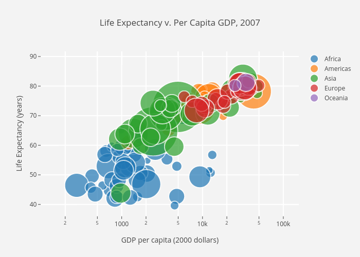
Here are some Python data visualization examples using popular libraries like Matplotlib and Seaborn:
Line Plot:import matplotlib.pyplot as pltimport numpy as np
x = np.arange(0, 10, 0.1)
y = np.sin(x)
plt.plot(x, y)
plt.xlabel('X Axis')
plt.ylabel('Y Axis')
plt.title('Sine Wave')
plt.show()
This code generates a simple line plot showing the sine wave function.
Bar Chart:import matplotlib.pyplot as pltfruits = ['Apple', 'Banana', 'Cherry']
counts = [3, 5, 2]
plt.bar(fruits, counts)
plt.xlabel('Fruit')
plt.ylabel('Count')
plt.title('Fruit Counts')
plt.show()
This code creates a bar chart showing the count of different fruits.
Histogram:import matplotlib.pyplot as pltimport numpy as np
data = np.random.normal(0, 1, 1000)
plt.hist(data, bins=30)
plt.xlabel('Value')
plt.ylabel('Frequency')
plt.title('Histogram of Random Data')
plt.show()
This code generates a histogram showing the distribution of random data.
Scatter Plot:import matplotlib.pyplot as pltimport numpy as np
x = np.random.normal(0, 1, 100)
y = np.random.normal(0, 1, 100)
plt.scatter(x, y)
plt.xlabel('X Axis')
plt.ylabel('Y Axis')
plt.title('Scatter Plot of Random Data')
plt.show()
This code creates a scatter plot showing the relationship between two sets of random data.
Heatmap:import seaborn as snsimport matplotlib.pyplot as plt
tips = sns.load_dataset('tips')
sns.set()
sns.heatmap(tips.corr(), annot=True, cmap='coolwarm', square=True)
plt.title('Correlation Matrix')
plt.show()
This code generates a heatmap showing the correlation matrix of the tips dataset.
Box Plot:import seaborn as snsimport matplotlib.pyplot as plt
tips = sns.load_dataset('tips')
sns.set()
sns.boxplot(x='day', y='total_bill', data=tips)
plt.title('Total Bill by Day')
plt.show()
This code creates a box plot showing the distribution of total bill amounts by day.
Pie Chart:import matplotlib.pyplot as pltfruits = ['Apple', 'Banana', 'Cherry']
counts = [3, 5, 2]
plt.pie(counts, labels=fruits, autopct='%1.1f%%')
plt.title('Fruit Counts')
plt.show()
This code generates a pie chart showing the count of different fruits.
These are just a few examples of the many types of data visualizations you can create with Python and popular libraries like Matplotlib and Seaborn.
Can you visualize data in Python?

I'd be happy to help!
Yes, Python provides various ways to visualize data, making it a powerful tool for data analysis and visualization. Here are some popular methods:
Matplotlib: Matplotlib is one of the most widely used plotting libraries in Python. It allows you to create a variety of plots such as line plots, scatter plots, histograms, bar charts, and more. You can customize the appearance of your plot by changing colors, fonts, labels, and other attributes. Seaborn: Seaborn is built on top of Matplotlib and provides a high-level interface for creating informative and attractive statistical graphics. It includes tools for creating visualizations like scatter plots, box plots, and heatmaps, as well as statistical graphics like regression lines and error bars. Plotly: Plotly is another popular plotting library that allows you to create interactive, web-based visualizations. You can create a wide range of plots, including 2D and 3D charts, heatmaps, scatter plots, and more. Plotly also includes tools for creating animations and interactively exploring data. Bokeh: Bokeh is another plotting library that provides elegant, concise construction of versatile graphics, and also delivers this construction as a web-useable application embedded into the webpage by providing sensible default mappings from Python logical structures to common representations.Here's an example code snippet using Matplotlib:
import matplotlib.pyplot as plt
x = [1, 2, 3, 4, 5]
y = [2, 4, 6, 8, 10]
plt.plot(x, y)
plt.xlabel('X Axis')
plt.ylabel('Y Axis')
plt.title('Line Plot Example')
plt.show()
This code creates a simple line plot with x and y coordinates. You can customize the appearance of the plot by adding more lines, changing colors, fonts, labels, and other attributes.
In addition to these libraries, Python also provides built-in functions for creating visualizations, such as:
pandas library's plot() function: This allows you to create plots directly from pandas data structures. numpy library's plot() function: This provides basic plotting functionality for 1D and 2D arrays.
These are just a few examples of the many ways you can visualize data in Python. The choice of library often depends on your specific use case, personal preference, and the type of visualization you want to create.
