Why is seaborn a good way to visualize data in Python?
Why is seaborn a good way to visualize data in Python?
I'm happy to respond in English!
Seaborn is an excellent library for visualizing data in Python, and its popularity stems from several reasons. Here are some key factors that make it stand out:
Integration with Pandas: Seaborn seamlessly integrates with Pandas, one of the most widely used libraries for data manipulation and analysis in Python. This means you can easily load your data into Pandas, perform various operations, and then visualize it using Seaborn.
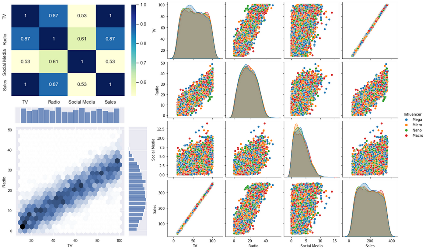
Visualization flexibility: Seaborn offers a wide range of visualization options, including:
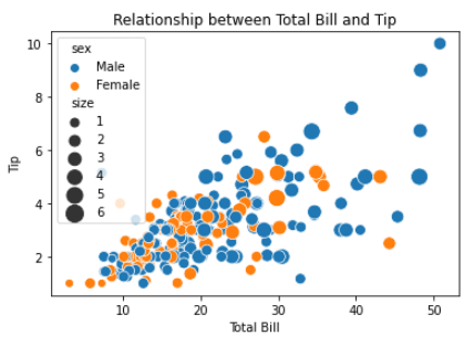
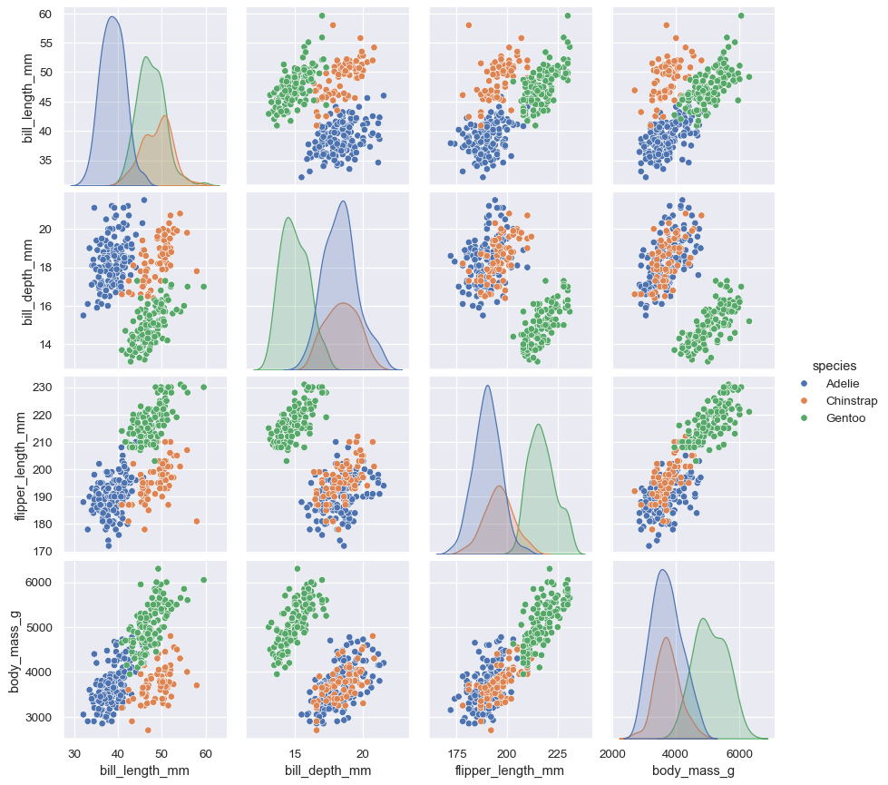
These visualization types are designed to help you better understand complex relationships, trends, and patterns in your data.
Context-aware visualizations: Seaborn is clever about automatically setting parameters based on the nature of your data, such as:
Scaling: It can automatically scale x-axes for dates or timeseries data. Color palettes: It provides a range of color schemes to help highlight important features.Customization and extension: Seaborn is highly customizable, allowing you to tweak aspects like plot size, fonts, colors, and more. You can also extend its functionality using other Python libraries, such as Matplotlib or Plotly.
Ease of use: Seaborn's API is intuitive and straightforward, making it easy for beginners to get started with data visualization. Even if you're not familiar with Seaborn's specific functions, the library provides helpful documentation and examples to help you learn.
Comprehensive documentation: Seaborn comes with comprehensive documentation that covers all its features, including tutorials, examples, and code snippets. This makes it easy for users to find answers to common questions or explore new visualization possibilities.
Large community support: Seaborn has an active user base and a large community of developers who contribute to the library's growth and improvement. This means you'll often find helpful discussions on forums like Reddit (r/learnpython, r/Python) or Stack Overflow.
Growing ecosystem: As part of the broader Python data science landscape, Seaborn benefits from the growth of related libraries like Pandas, NumPy, Scikit-learn, and more. This means you can easily integrate Seaborn with other tools in your workflow.
In summary, Seaborn's versatility, ease of use, and extensive customization options make it an excellent choice for visualizing data in Python. Its integration with Pandas, flexibility in visualization types, and comprehensive documentation further solidify its position as a top-notch library for data visualization.
Seaborn python examples github
I'm happy to provide a response in English!
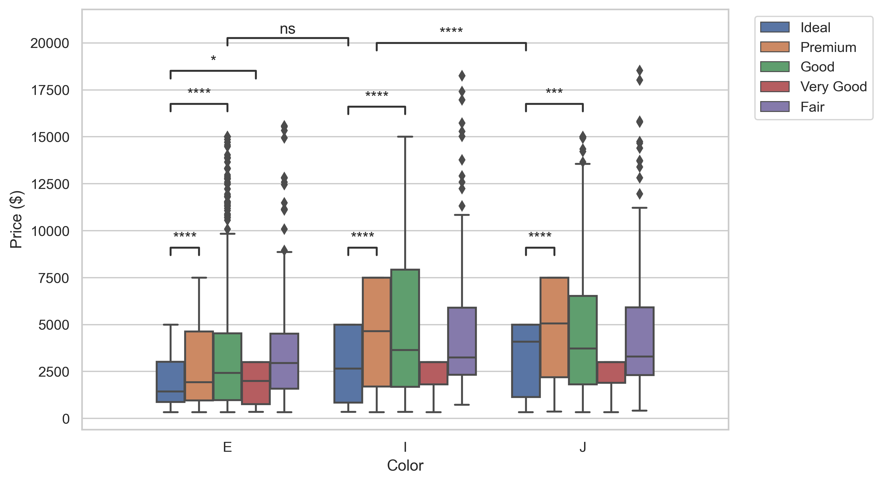
Seaborn is a Python data visualization library based on matplotlib. It provides a high-level interface for drawing attractive and informative statistical graphics.
If you're looking for some Seaborn examples on GitHub, here are a few notable ones:
Seaborn Examples: This repository contains a collection of examples showcasing various features and capabilities of the Seaborn library. You can find code snippets and visualizations for tasks such as: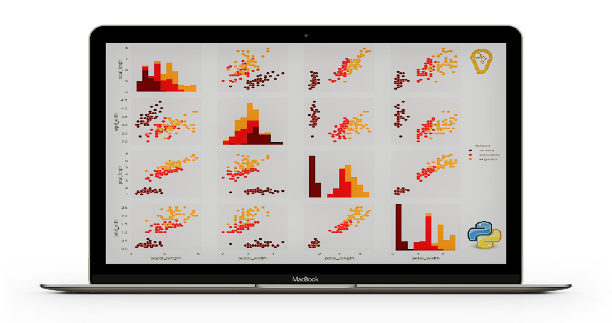
These repositories offer a great starting point for anyone looking to learn more about Seaborn or apply its capabilities in their own projects.
Remember: When it comes to data visualization, it's all about storytelling! By choosing the right visualization and presenting your findings effectively, you can communicate complex insights to your audience in a clear and compelling manner.
Now, go forth and explore the world of Seaborn examples on GitHub!
