Python data visualization examples
Python data visualization examples
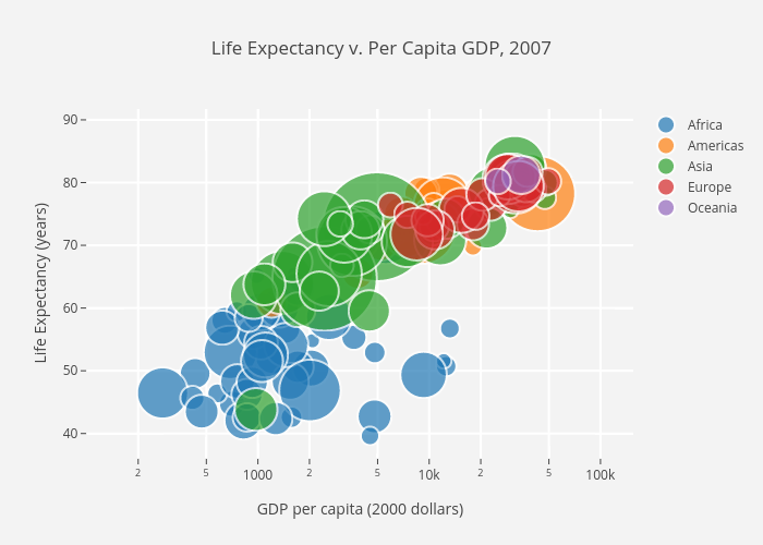
Here are some Python data visualization examples using popular libraries like Matplotlib and Seaborn:
Line Plot:import matplotlib.pyplot as pltimport numpy as np
x = np.arange(0, 10, 0.1)
y = np.sin(x)
plt.plot(x, y)
plt.xlabel('X Axis')
plt.ylabel('Y Axis')
plt.title('Sine Wave')
plt.show()
This code generates a simple line plot showing the sine wave function.
Bar Chart:import matplotlib.pyplot as pltfruits = ['Apple', 'Banana', 'Cherry']
counts = [3, 5, 2]
plt.bar(fruits, counts)
plt.xlabel('Fruit')
plt.ylabel('Count')
plt.title('Fruit Counts')
plt.show()
This code creates a bar chart showing the count of different fruits.
Histogram:import matplotlib.pyplot as pltimport numpy as np
data = np.random.normal(0, 1, 1000)
plt.hist(data, bins=30)
plt.xlabel('Value')
plt.ylabel('Frequency')
plt.title('Histogram of Random Data')
plt.show()
This code generates a histogram showing the distribution of random data.
Scatter Plot:import matplotlib.pyplot as pltimport numpy as np
x = np.random.normal(0, 1, 100)
y = np.random.normal(0, 1, 100)
plt.scatter(x, y)
plt.xlabel('X Axis')
plt.ylabel('Y Axis')
plt.title('Scatter Plot of Random Data')
plt.show()
This code creates a scatter plot showing the relationship between two sets of random data.
Heatmap:import seaborn as snsimport matplotlib.pyplot as plt
tips = sns.load_dataset('tips')
sns.set()
sns.heatmap(tips.corr(), annot=True, cmap='coolwarm', square=True)
plt.title('Correlation Matrix')
plt.show()
This code generates a heatmap showing the correlation matrix of the tips dataset.
Box Plot:import seaborn as snsimport matplotlib.pyplot as plt
tips = sns.load_dataset('tips')
sns.set()
sns.boxplot(x='day', y='total_bill', data=tips)
plt.title('Total Bill by Day')
plt.show()
This code creates a box plot showing the distribution of total bill amounts by day.
Pie Chart:import matplotlib.pyplot as pltfruits = ['Apple', 'Banana', 'Cherry']
counts = [3, 5, 2]
plt.pie(counts, labels=fruits, autopct='%1.1f%%')
plt.title('Fruit Counts')
plt.show()
This code generates a pie chart showing the count of different fruits.
These are just a few examples of the many types of data visualizations you can create with Python and popular libraries like Matplotlib and Seaborn.
Which data visualization tool is best for Python?

What a great question!
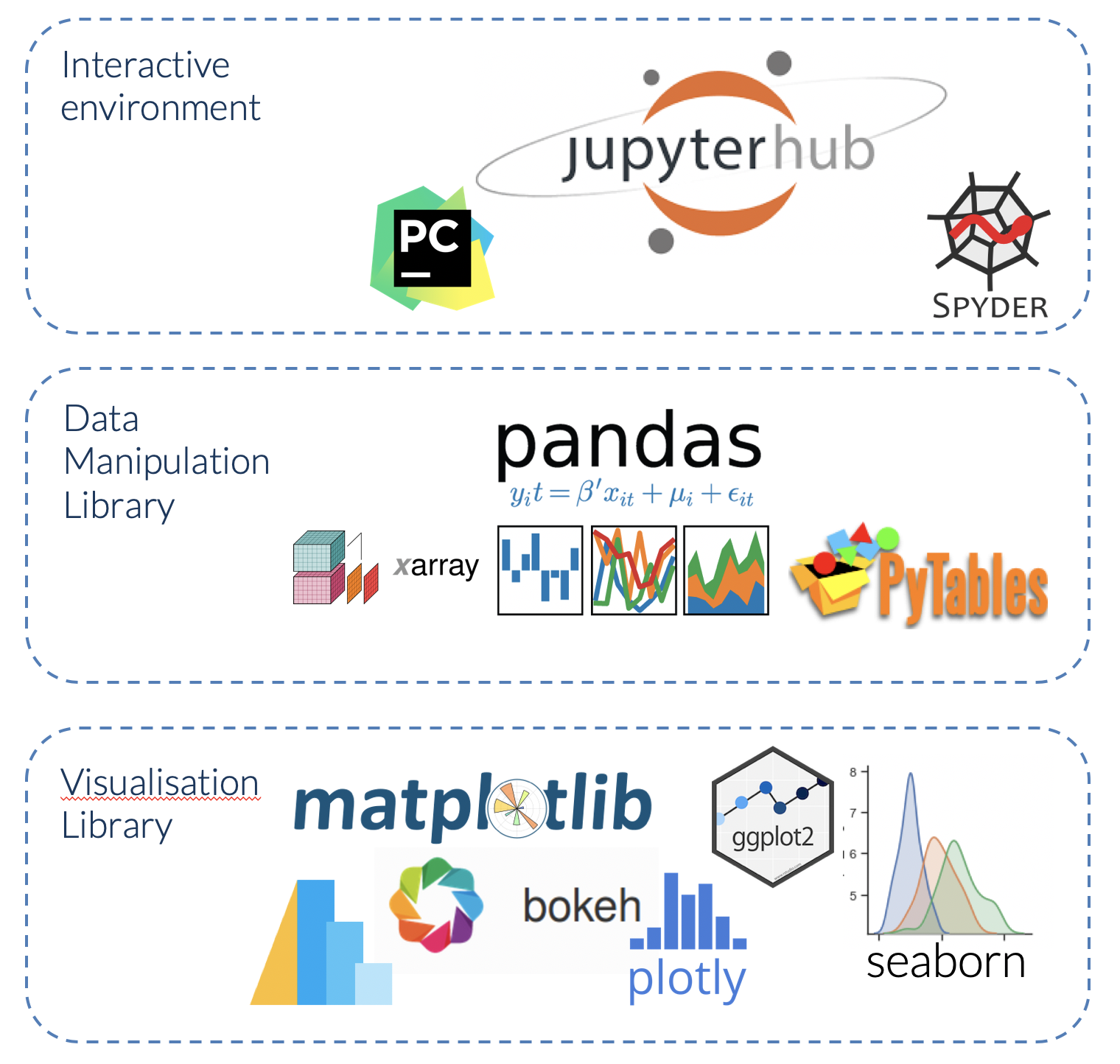
When it comes to data visualization tools for Python, the options are vast and exciting! In this response, I'll cover some of the most popular ones, highlighting their strengths and weaknesses.
Strengths: Easy to learn, versatile, customizable
Weaknesses: Can be resource-intensive, not ideal for interactive visualizations
Seaborn: Seaborn is a visualization library built on top of Matplotlib, designed specifically for statistical data exploration and visualization. It provides a high-level interface for creating attractive and informative statistical graphics, such as scatterplots, bar charts, box plots, and heatmaps.Strengths: Beautiful visualizations, easy to use, integrates well with other libraries
Weaknesses: Limited customization options compared to Matplotlib
Plotly: Plotly is a popular interactive visualization library that allows you to create web-based interactive plots. It supports over 40 unique chart types, including line charts, bar charts, scatter plots, and more. Its Python API makes it easy to integrate with other libraries and frameworks.Strengths: Interactive visualizations, extensive chart options, easy integration
Weaknesses: Steeper learning curve compared to Matplotlib, not ideal for static visualizations
Bokeh: Bokeh is another interactive visualization library that allows you to create web-based interactive plots. It's designed specifically for building complex, high-performance applications. Its Python API provides a wide range of tools for creating custom visualizations.Strengths: High-performance capabilities, extensive customization options, easy integration
Weaknesses: Steeper learning curve compared to Matplotlib, not ideal for simple visualizations
Altair: Altair is a relatively new visualization library that combines the simplicity of Vega-Lite with the power of Python. It allows you to create interactive and non-interactive visualizations using a JSON-based syntax.Strengths: Easy to learn, interactive capabilities, customizable
Weaknesses: Limited chart options compared to Plotly or Bokeh
In conclusion, each data visualization tool has its unique strengths and weaknesses. The best choice for you depends on your specific needs, experience level, and the type of visualizations you want to create.
If you're looking for easy-to-use, flexible, and customizable visualizations, Matplotlib is an excellent choice. For statistical data exploration and visualization, Seaborn is a great option. If you want to create interactive web-based visualizations with extensive chart options, Plotly or Bokeh might be the way to go. If you prefer a more JSON-based syntax for creating interactive or non-interactive visualizations, Altair could be the perfect fit.Remember, practice makes perfect! Try out each library and see which one suits your needs best.
