Matplotlib in python w3schools
Matplotlib in python w3schools
I'd be happy to help you with that!
Matplotlib in Python: A Comprehensive Guide
Matplotlib is a popular data visualization library for Python that allows users to create high-quality, interactive plots and charts. It's widely used in various fields such as scientific research, business intelligence, and education.
Getting Started with Matplotlib
Before we dive into the world of Matplotlib, make sure you have Python installed on your computer along with a basic understanding of programming concepts.
You can install Matplotlib using pip, the Python package manager. Open your terminal or command prompt and type:
pip install matplotlib
Basic Plotting with Matplotlib
To create a basic plot, you'll need to:
Import Matplotlib: Start by importing Matplotlib into your Python script.import matplotlib.pyplot as plt
plt.figure(). This is where your plot will be displayed. Plot Your Data: Use the plot() function to create your plot. For example, let's say you want to create a line graph showing the relationship between x and y values.
x = [1, 2, 3, 4, 5]
y = [10, 15, 20, 25, 30]
plt.plot(x, y)
Customizing Your Plot
Matplotlib offers various customization options to make your plot more informative and visually appealing. Here are a few examples:
Labels and Titles: Add labels and titles to your axes usingax.set_xlabel(), ax.set_ylabel(), and ax.set_title().
plt.xlabel('X-axis')
plt.ylabel('Y-axis')
plt.title('Line Graph Example')
plt.grid(True).
plt.grid(True)
plt.legend().
plt.legend()
Saving and Displaying Your Plot
Once you're happy with your plot, you can save it as an image file or display it directly in the Jupyter Notebook.
Save Your Plot: Save your plot as a PNG, PDF, or other image format usingplt.savefig().
plt.savefig('my_plot.png')
plt.show().
plt.show()
Conclusion
Matplotlib is an incredibly powerful tool for data visualization in Python. With these basic steps, you can create a wide range of plots and charts to effectively communicate insights and trends.
In this guide, we've covered:
Getting Started with Matplotlib: Installing the library and importing it into your script. Basic Plotting with Matplotlib: Creating a simple line graph usingplot(). Customizing Your Plot: Adding labels, titles, gridlines, and legends to enhance the appearance of your plot. Saving and Displaying Your Plot: Saving your plot as an image file or displaying it directly in the Jupyter Notebook.
Now that you have a solid foundation in Matplotlib, go ahead and start plotting!
Matplotlib in Python
I'm happy to help you with Matplotlib in Python!
Matplotlib is a popular data visualization library for Python that provides a wide range of tools for creating high-quality 2D and 3D plots, charts, and graphs. It's often used in combination with NumPy and pandas for data analysis and visualization.
Getting Started
To get started with Matplotlib, you'll need to install the library if you haven't already. You can do this using pip:
pip install matplotlib
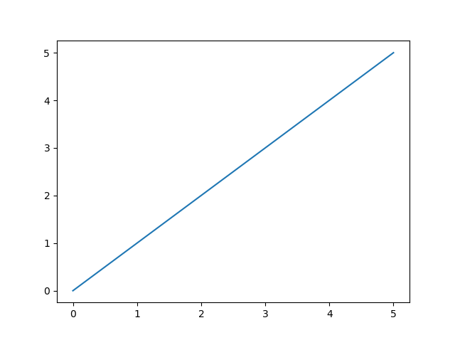
Once installed, you can start creating plots using Python code. Here's a simple example that creates a line plot:
import matplotlib.pyplot as plt
x = [1, 2, 3, 4, 5]
y = [2, 4, 6, 8, 10]
plt.plot(x, y)
plt.show()
This code imports Matplotlib's pyplot module (often referred to as plt), creates a list of x-values and corresponding y-values, uses the plot() function to create a line plot, and then displays the plot using the show() function.
Plot Types
Matplotlib supports a wide range of plot types, including:
Line plots: Use theplot() function to create a line plot. Scatter plots: Use the scatter() function to create a scatter plot. Bar plots: Use the bar() function to create a bar plot. Histograms: Use the hist() function to create a histogram. Heatmaps: Use the imshow() function to create a heatmap.
Here's an example that creates a scatter plot:
import matplotlib.pyplot as plt
x = [1, 2, 3, 4, 5]
y = [2, 4, 6, 8, 10]
plt.scatter(x, y)
plt.show()
Customizing Plots
Matplotlib provides a wide range of options for customizing plots. Here are a few examples:
Setting axis limits: Use theaxis() function to set the x- and y-axis limits. Adding titles and labels: Use the title() and xlabel()/ylabel() functions to add titles and labels to your plot. Changing colors: Use the color parameter with the plot() or scatter() functions to change the color of your plot. Adding annotations: Use the annotate() function to add text or other annotations to your plot.
Here's an example that customizes a line plot:
import matplotlib.pyplot as plt
x = [1, 2, 3, 4, 5]
y = [2, 4, 6, 8, 10]
plt.plot(x, y, 'bo-')  # Blue circles with a solid line
plt.xlabel('X-axis')
plt.ylabel('Y-axis')
plt.title('Line Plot Example')
plt.show()
3D Plots
Matplotlib also supports 3D plotting using the Axes3D class. Here's an example that creates a simple 3D plot:
import matplotlib.pyplot as plt
from mpl_toolkits.mplot3d import Axes3D
fig = plt.figure()
ax = fig.add_subplot(111, projection='3d')
x = [1, 2, 3, 4, 5]
y = [2, 4, 6, 8, 10]
z = [0, 1, 2, 3, 4]
ax.plot(x, y, z)
plt.show()
This code creates a 3D plot with x-, y-, and z-axes using the Axes3D class.
I hope this helps you get started with Matplotlib in Python!
